| Category |
Coursework |
Subject |
Management |
| University |
University Of Greenwich |
Module Title |
BIOT1012 Research Methods, Biostatistics & Data Management |
Coursework Overview
1. During this course, you will be mainly using Microsoft Excel (or SPSS/other software if you want) to analyse your data and then you will need to produce a word file report to be submitted as a formative assessment (date of submission is TBD).
. The purpose of the IT session is to give you the opportunity to learn through example data and to figure out using Excel as a software for statistical analyses and interpretation.
3. In the IT lab, please run the analyses in Excel file, and then once you are done with a particular analyses, put an organized form of your answer (This should contain figures, tables or interpretations as requested in each task) in a separate word file.
4. Note that this word file report that you will generate by the end of the IT sessions will represent the formative assessment for this module. This will be submitted towards the end of the IT sessions.
5. How you create the coursework report (the word file)?
3.1. At the end of all IT session, you will need to submit a coursework report in a form of a word file. This will be your formative assessment. You create this word file based on your answers in the Excel file.
3.2. Each IT lab will have its own exercises (numbered 1, 2, etc.) and datasets (aligned as possible with the lecture contents of the same week) and you would need to answer the tasks associated with these, put your answers in Excel file and use this to create your final word file coursework report. .
3.3. In your Excel file, type each data set into a spreadsheet (name the sheet accordingly), save the Excel file data using a suitable file name in a location that you can retrieve for future use. It is entirely your responsibility to ensure that you have adequate backups of your data. There is no excuse for losing data and this is not an excuse for poor performance in the final MCQ assessment.
3.4. Make sure to update any copy you have made accordingly. If you do not understand how to store your data safely, please consult the tutor/module leader.
6. By the end, you will produce one word file report containing the answers for the tasks.
Exercise 1: Descriptive statistics and data distribution
Background Information:
In the context of data analyses, it is important to be able to summarize your data in a way that makes it easier for others to absorb. It is also important to check whether the collected data are normally distributed or not. This is of importance because it determines whether you will be analysing your data using parametric or non-parametric tests. There are several ways of testing data normality. A quick way is to plot the data using specific graphs (e.g. histogram) and to explore data descriptive statistics, which could give an indication of normality. A numerical method, that is more accurate, is to calculate expected values using the equation for a Gaussian distribution (Equation 1.1), and then use a “chi-squared”, χ2, “goodness-of-fit” test to check that your observed data are not statistically significantly different from that predicted by a Gaussian distribution.
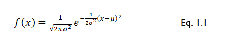
Where f(x) is the frequency of variable x, σ is the population standard deviation, x is the variable that you are probing, and µ is the population mean.
The data:
Table 1.1 below shows a data set representing the measurements of absorption rate of drugs A and B (mg/hr) collected from multiple study participants. Absorption rates of drug A were collected from 30 participants, whereas absorption rates of drug B were collected from 73 participants. Note that table 1.1 is continued on the next page.
|
Table 1.1. Absorption rates of drug A and B (mg/hr) for the participants of the study. Note that the table is continued in the next page
|
|
Absorption Rate of drug A (mg/hr)
N of participants = 30
|
Absorption Rate of drug B (mg/hr).
N of participants = 73
|
|
1
|
0
|
4
|
7
|
|
1.2
|
0
|
4
|
7
|
|
1.5
|
0
|
4
|
7
|
|
2
|
0
|
4
|
7
|
|
2.5
|
1
|
4
|
7
|
|
3
|
1
|
4
|
7
|
|
3.5
|
1
|
4
|
7
|
|
4
|
1
|
4
|
7
|
|
5
|
1
|
4
|
7
|
|
5.5
|
2
|
4
|
8
|
|
6
|
2
|
6
|
8
|
|
6.5
|
2
|
6
|
8
|
|
7
|
2
|
6
|
8
|
|
7.5
|
2
|
6
|
9
|
|
8
|
2
|
6
|
10
|
|
9
|
2
|
6
|
|
|
10
|
2
|
6
|
|
|
12
|
2
|
6
|
|
|
14
|
2
|
6
|
|
|
13
|
5
|
3
|
|
|
12
|
5
|
3
|
|
|
19
|
5
|
3
|
|
|
14
|
5
|
3
|
|
|
19.8
|
5
|
3
|
|
|
20
|
5
|
3
|
|
|
20
|
5
|
3
|
|
|
1.2
|
5
|
3
|
|
|
1.5
|
5
|
3
|
|
|
20.5
|
5
|
3
|
|
|
21
|
|
|
|
You are tasked with calculating the frequency of the observations for both groups (drugs A and B). In doing this, please consider the bin values for each drug group shown in table 1.2 below. You will notice that the bin values in drug A were determined for a range of numbers (the range is shown in column “range”), which is not the case for drug B, where the bin values represent a single number rather than a range. In either case, you will calculate the frequency and plot the graph based on the bin values. Use the bin ranges for drug A only in case you would like to check the correctness of the frequency output that you will calculate in excel.
|
Table 1.2. Bin values for both groups
|
|
Drug A
|
Drug B
|
|
Bin values
|
Bin range (mg/hr)
|
Bin values
|
|
5
|
1.0 - 5.0
|
0
|
|
10
|
5.1 - 10.0
|
1
|
|
15
|
10.1 - 15.0
|
2
|
|
20
|
15.1 - 20.0
|
3
|
|
25
|
20.1 - 25.0
|
5
|
|
|
|
6
|
|
|
|
7
|
|
|
|
8
|
What you have to do:
- For both groups, plot the data given in table 1.1 using a histogram that shows the distribution of both data.
- For both groups, determine the descriptive statistics (Mean, standard error, standard deviation, median, mode, variance, kurtosis, skewness, etc.), including the relative standard deviation (RSD). Note that you can report all descriptive statistics using the option of “data analyses” adds-on in excel except for the RSD. You would need to calculate the RSD separately in excel. Please revise the lecture material to do this task.
- For both groups, determine the observed frequency of the bin values shown in table 1.2 as calculated in excel. Confirm this by using the function “FREQUENCY” in excel.
- For both groups, calculate the predicted probability using the function “NORM.DIST” in excel (given the mean and the standard deviation for both groups) and then calculate the predicted frequency (predicted numbers) of the bin values.
- For both groups, perform a χ2 test (goodness of fit) to obtain χ2cal and thus to determine if the data in both groups follow a normal distribution. You will need Equation1.2 to do this Equation 2
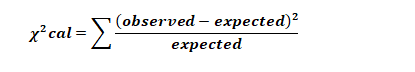
where “expected” is the predicted numbers to fall within a given range (predicted frequency) and the “observed” is the number of values actually observed to fall within a given range (observed frequency).
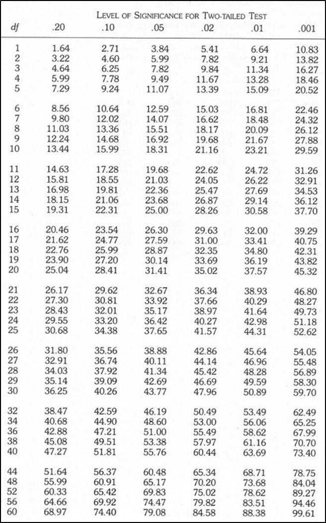
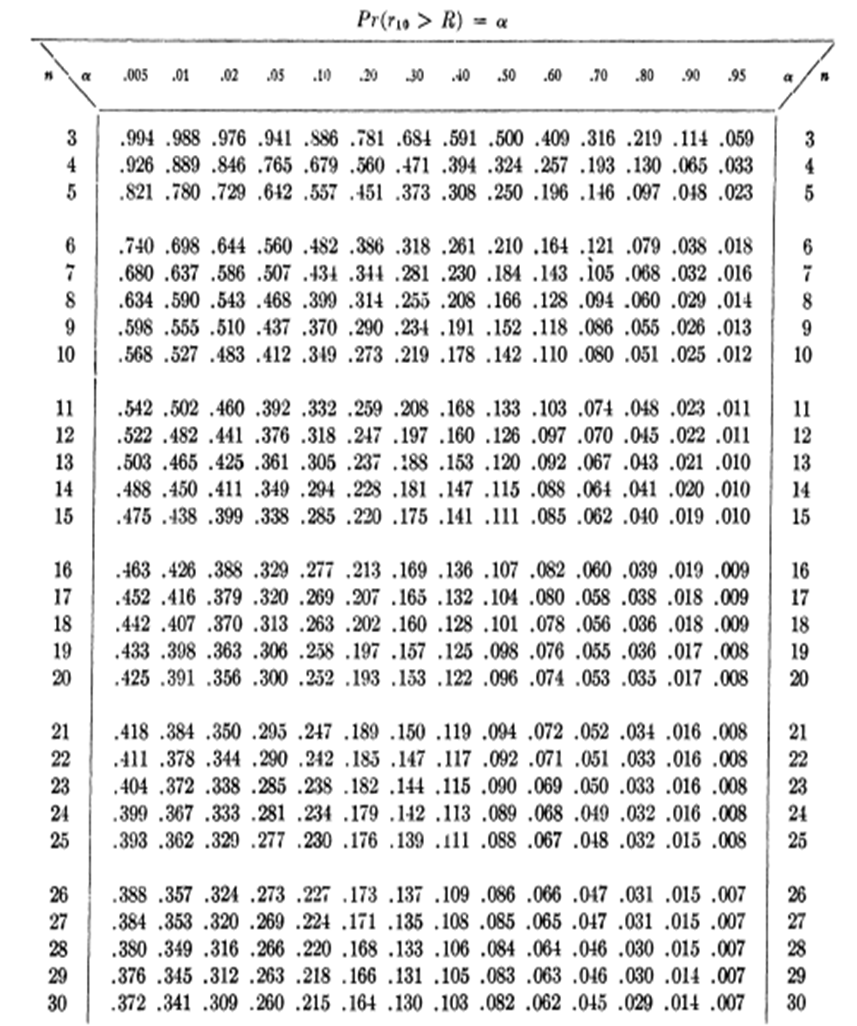
6. Find the χ 2critical from Table 1.3 below given the p-value threshold = 0.05 and the degrees of freedom = 8. You will find Table 1.3 also on moodle.
7. For both groups, confirm your results by calculating the predicted p value for this test and for this data. In Excel, this can be done using the function “CHITEST”.
What you have to report
- Plot a histogram of the data in table 1.1 for each group (drug A and drug B). Describe the shape of the curve fitted to the distribution for both groups.
- Report all the descriptive statistics of the data in both groups, including the RSD.
- Report the distribution of the data in both groups – this is to report whether it is normally or non-normally distributed.
- Looking at the mean and median in both group, do these two parameters give any indication on data normality for both groups? and does this supports the shape of the histogram for both groups?
- Which of the two groups has more within-group variation than the other? Which parameter in the descriptive statistics could tell this? and why particularly these parameters are good indicators?
- What is the observed frequency of the bin values for both groups?
- What is the predicted probability and predicted frequency of the data in both groups?
- Report the calculations of χ2, “goodness-of-fit” test including the χ2cal and χ2critical
- Report the p-value calculated by the function “CHITEST”
- What is the distribution of the data in both groups given the results of the χ2, “goodness-of-fit test and the p-value? Did this agrees with the histogram distribution?
Table 1.3. Critical values of χ 2
Exercise 2: Detecting an outlier value using Dixon’s Q test and quartiles
Background Information:
The presence of an outlier value would bias your analyses.
You have measured (in ppt – parts per trillion) the concentration of dioxins (toxin compound) in blood plasma samples taken from 10 individuals, who have been exposed to industrial pollution. You measured the concentrations.
The data:
You have the following data (measured in ppt – parts per trillion) for Blood dioxin concentrations (ppt):
0.9, 1.0, 1.1, 1.2, 10.0, 0.5, 0.6, 0.7, 2.0, 2.5,
Because you are trying the identification protocol for the first time, you suspect that one value is an outlier, but you do not know which. Use data analyses to detect which value might be the outlier using Dixon’s Q Test, and then confirm this with quartiles and then determine what effect did this outlier has on the parameters of the data?
Use the following equation to run the Dixon’s Q test.

x:is the suspected outier
x_((next) ):this is value next in order to x
x_((max) ): The largest value in the dataset
x_min:The smallest value in the dataset
Use Table 2.1 to calculate Q table
To calculate the quartiles, use the equation QUARTILE in Excel.
The function looks like this:
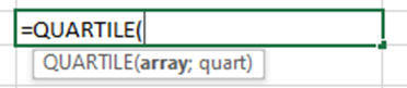
array: The range of cells that contains the data set.
quart: The quartile to return:
0: Minimum value (the 0th percentile).
1: First quartile (Q1), also known as the 25th percentile.
2: Second quartile (Q2), also known as the median or 50th percentile.
3: Third quartile (Q3), also known as the 75th percentile.
4: Maximum value (the 100th percentile).
Use the materials from the lecture to determine how to confirm outliers using Dixon’s test and quartile.
What you have to do and report:
- Report full descriptive statistics of these measurements (before outlier removal)
- Follow the steps explained in the lecture materials to suspect outlier values and to determine and confirm which value might be an actual outlier using Dixon’s Q Test to confirm this.
- Calculate the quartiles (using QUARTILE function) and interquartile range (IQR) to confirm if this value is an outlier (to validate the results of Q test).
- Which graph is suitable to visualize if the data contains an outlier?
- Report full descriptive statistics of these measurements (after removing the outlier point).
- Describe what happens to data variance and SD, SEM, mean, etc. after outlier removal.
Table 2.1 Critical values for Dixon’s Q test.
Exercise 3: Determine probability of random value from a normally distributed populations
Background Information
For a particular value X, the NORM.DIST function in Excel (if you the cumulative probability which corresponds to the TRUE selection when you write the formula) calculates you the probability (the chance) that a randomly selected value from a normally distributed population will be ≤ the value X. In other words, it calculates the area under the normal distribution curve to the left of the value X.
For example: Let's say you have a normal distribution with a mean of 100 and a standard deviation of 15, and you want to calculate the cumulative probability for x = 120.
The formula in Excel will be like this
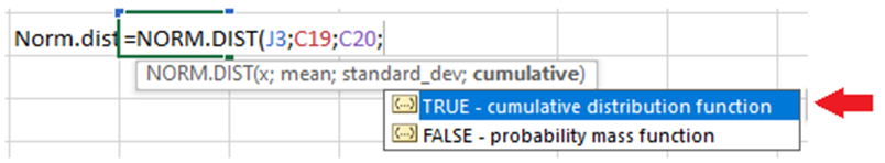
Make sure to select the option TRUE at the end of this equation. This will get you the cumulative probability.
Running this function will shows like this:
=NORM.DIST(120, 100, 15, TRUE)
This formula will calculates the probability that a value from the distribution is less than or equal to 120. In other words, it calculates the area under the curve to the left of x = 120.
Interpretation:
If the result is 0.908, it means that there is an 90.8% chance that a value from this distribution will be less than or equal to 120.
Data
It is a usual practice for commercial provider (scheme provider) to test the efficiency of analytical methods in laboratories by comparing the laboratory results against their established standards.
A scheme provider established its own standard measures (See table 3.1 below) for the concentration of sodium bicarbonate and is using his measurement to approve the quality of other laboratories. Two laboratories submitted their measurements to the scheme provider to be approved.
Laboratory A: mean (μ) concentration of sodium bicarbonate = 100.2 mg/L
Laboratory B: mean (μ) concentration of sodium bicarbonate = 105 mg/L
Imagine you are the scheme provider; use your data analysis skills to determine which of the two laboratories would obtain approvals (if their concentrations lie in the range determined by the scheme provider’s value). You can do this by using NORM.DIST function in excel.
What you have to do and report in the word file:
- Obtain the mean and standard deviation of the values measured by the scheme providers (the values in table 3.1).
- Run the equation of NORM.DIST in Excel to obtain the cumulative probability
- What is the probability that a randomly picked value from the measurements of that provider would be ≤ the means of those laboratories?
- If you were the scheme provide, based on these results would you accept/approve the results from Lab A or lab B and why?
|
Table 3.1 Commercial provider values
|
|
98.4
|
101
|
98.3
|
|
100.3
|
102
|
100.2
|
|
99.6
|
99.1
|
98.6
|
|
100.8
|
98.5
|
100.3
|
|
101.1
|
99.3
|
101.6
|
|
99.5
|
99.2
|
99.9
|
|
100.4
|
100.7
|
101.5
|
|
99.4
|
102.1
|
100
|
|
99.8
|
99.2
|
97
|
|
101.2
|
99.8
|
100.9
|
|
98.8
|
100
|
100.6
|
|
98.7
|
102.3
|
101.3
|
|
100.5
|
100.1
|
98.9
|
|
|
99.7
|
100.1
|
|
|
|
|
Exercise 4: F-tests, T-tests, ANOVA and post-hoc test
Background Information:
There is a published standard for the measurement of sun protection factors (SPF) of sunscreens that always come in different formulations and textures. Determining variances in SPF among suncreams formulations is important because of reasons such as efficacy assessments, consumers informed choices and product development guide.
Dimitrovska Cvetkovska et al. (Int. J. Cosmetic Sci., 2017, 39, 846-857) have analysed commercially available sunscreens using the ISO standard method, which they have labelled “ISO 2”.
The data:
Table 4.1 below shows the values of sun protection factors (SPFs) of 75 product that were claimed by the product manufacturers on the label of the sunscreen (column name: SPF values based on ISO 2). Also of note is the texture of the actual sunscreen product, which may influence the outcome of the tests. This came as 4- categories (i.e. creamy, fluid, liquid and paste) under the column named: Texture. Note that table 4.1 is continued in the next page
What you have to do:
- Enter the experimental data into a spreadsheet (give it a suitable name). Note: make sure that you have copied all the data of the 75 product into the spreadsheet by counting them in the Excel, (you can use COUNTA function in Excel to count occupied cells).
- Perform an F-test to determine if there is a statistically significant difference in the variances in the SPF values of the paste and creamy sunscreens at p = 0.05 (p-value is significant if it is < 0.05)
- Perform an appropriate t-test to determine if there is a statistically significant difference in SPF values between the paste and creamy sunscreens at p = 0.05. (p-value is significant if it is < 0.05)
- Perform an F-test to determine if there is a statistically significant difference in the variances in the SPF values of the fluid and liquid sunscreens at p = 0.05. (p-value is significant if it is < 0.05)
- Perform an appropriate t-test to determine if there is a statistically significant difference in SPF values between the fluid the liquid sunscreens at p = 0.05. (p-value is significant if it is < 0.05)
- Perform single-factor ANOVA test to determine if there is any significant difference between the SPF values for the 4 textures (liquid, fluid, creamy or paste) at p = 0.05 (p-value is significant if it is < 0.05). If you conclude any difference, use Bonferroni correction to calculate adjusted p value (based on a 1-tailed t-test between pairs of group) and to identify which two groups have that significant difference.
Remember: To calculate the Benferroni correction, follow the following:
- Calculate pairwise t-test (based on 1-tailed hypothesis) between pairs of suncream textures, then keep these results.
- Divide the 0.05 (the unadjusted p value) by the number of required t-test.
- Compare the obtained adjusted p value to the p value from the t-test.
What you have to report in the word file:
- Report the fcalc, fcrit, tcalc, tcrit and p values for all tests conducted in points 2 and 3 above. For t-test, report tcalc, tcrit and p valus for both one- and two-tailed tests. Using F-test, do variances of paste and creamy sunscreens differ significantly?
- Report if there is significant difference between the SPF values of the creamy and paste sunscreens as determined by the ISO 2 test.
- Report the fcalc, fcrit, tcalc, tcrit and p values for all tests conducted in points 4 and 5 above. For t-test, report tcalc, tcrit and p valus for both one- and two-tailed tests. Using F-test, do variances of fluid and liquid sunscreens differ significantly?
- Report if there is significant difference between the SPF values of the fluid and liquid sunscreens as determined by the ISO 2 test.
- Report the F value and Fcritical value, and the p value as calculated from the ANOVA test.
- Report the adjusted P-value of Bonferroni correction and state which groups have significant differences (if any). Please consider significant differences if the p-value (generated from the pairwise t-test) is ≤ the adjusted p value generated from Bonferroni correction.
- Report any other graphs you have used to support the results of the work detailed above
Table 4.1. Sun protection factors (SPF) for commercial sunscreen products and their different textures. Note: the table is continued on next page.
")
")
Exercise 5: Using paired T-test to determine if two paired observations are significantly different
Background Information:
Analysing batch effects (this effect happens when samples from different batches show significant differences) in nutritional supplements is crucial to ensure safety, quality and effectiveness, which in turn could support consumer confidence and regulatory compliance.
The Data
The following table (table 5.1) shows the values measured for 5-nutritional content (i.e. from the same original pool) over two batches (batch A and B). The aim is to analyse whether there is any batch effect by revealing the differences between the two batches for the same supplement using a paired t-test.
|
Table 5.1. The content of two batches of nutritional supplement.
|
|
Supplement
|
Batch A
|
Batch B
|
|
Fat
|
40
|
17.1
|
|
Vit C
|
25.5
|
7.9
|
|
Cabony lhydrate
|
33.5
|
17.8
|
|
Fiber
|
45.8
|
32.3
|
|
Protein
|
35.4
|
20.2
|
What you need to do and report:
1. Given the paired nature of these data, visualise the data in a way that most easily shows the difference between the two batches for each supplement.
2. Report the full results of t-test (for 1- and 2-tailed test).
3. Is there a significant difference in the values of the supplements between the two batches at p = 0.05
4. Is there a significant difference in the values of the supplements between the two batches at p = 0.01?
5. Comment on the results of the t-test and what this means in practice?
 Get Expert-crafted assignments